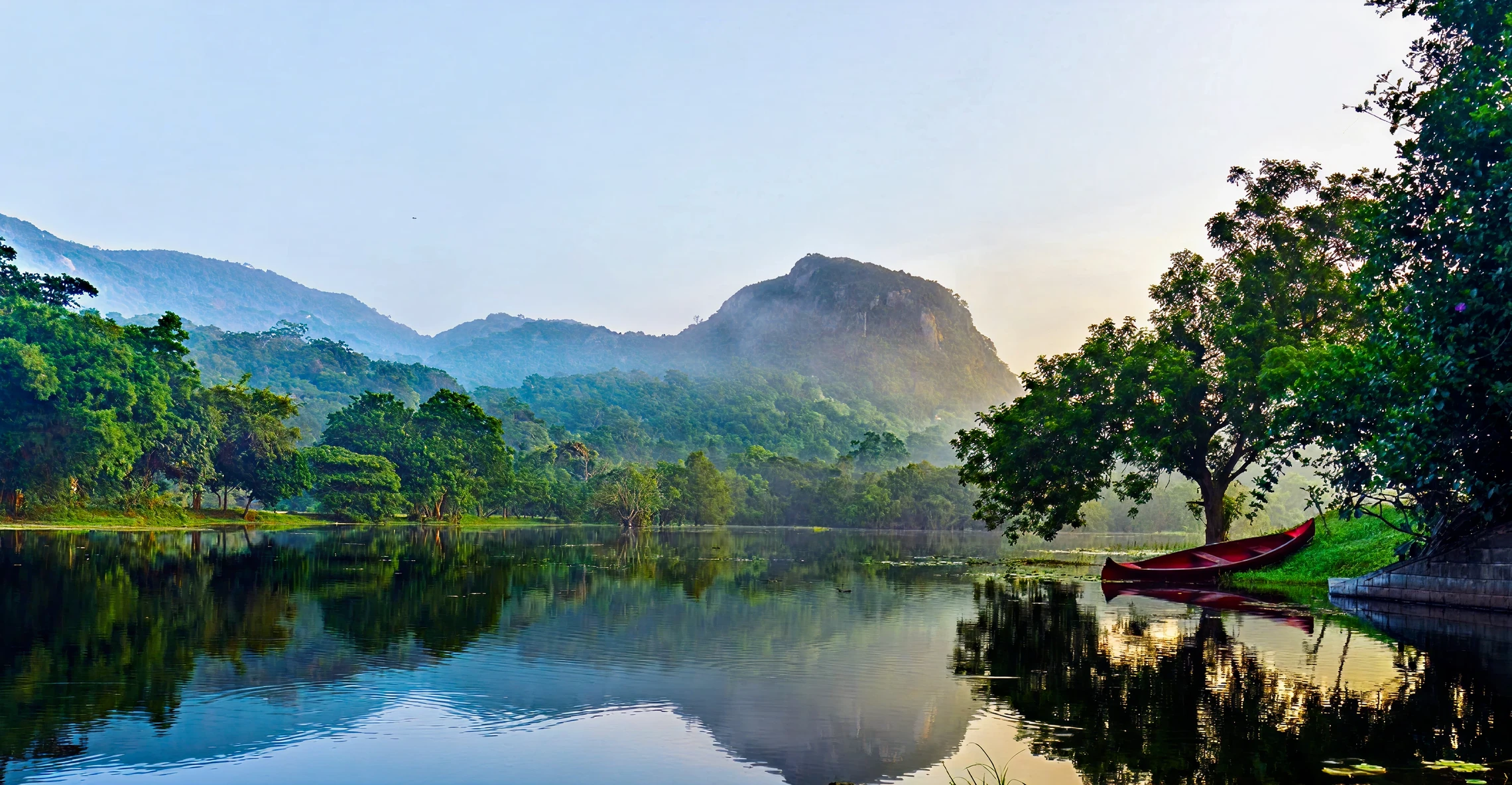
A little closer
to nature.
A website for a yoga and Ayurveda retreat in the heart of Sri Lanka. Designed to bring a sense of the place to the screen, and make the journey from curiosity to booking feel natural.
- My role
- Designer
- Year
- 2025
- Focus
- UX & UI design
A look back at my original design. Ulpotha has since launched a new website.
The starting point
Bring the feeling
of Ulpotha online.
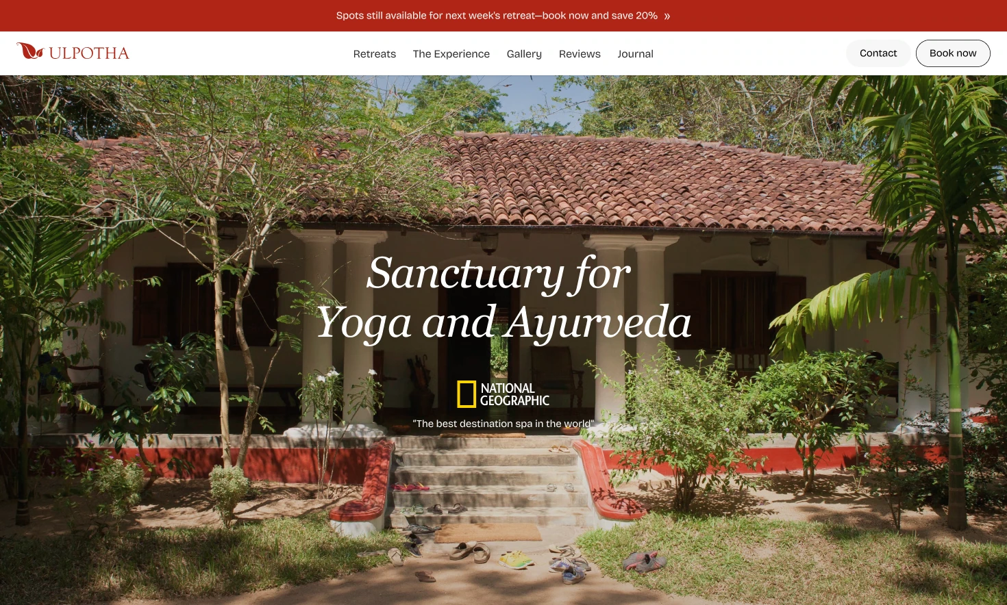
Ulpotha is a traditional village surrounded by nature, with yoga, Ayurveda, and a slower rhythm of life. I wanted the website to give people a feeling for that experience before asking them to plan a trip.
The challenge was to balance that atmosphere with the practical details: which retreat to choose, who is teaching, what is included, and how to book. The design needed room for both the story and the decisions.
Behind the screens
The process
From feeling the place to planning a stay.
Let the
place speak.
I gave photography the first word. A large image and a simple introduction let visitors take in the setting before moving into the details of a stay.
Generous space, expressive serif headings, and quiet navigation keep the interface in the background. Guest reviews and common questions give the practical reassurance alongside that first impression.
Design choice · Atmosphere first, detail as you explore.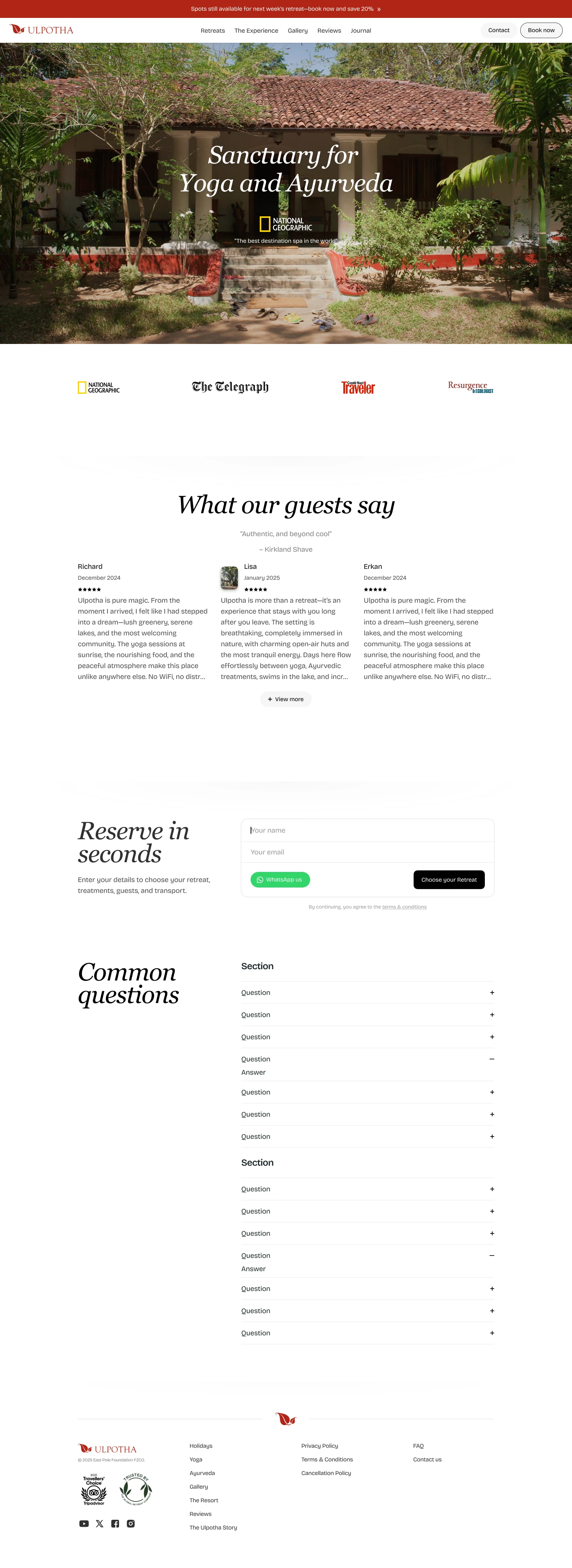
Find the right
retreat.
Once someone is interested, the questions change. When can I go? Who will be teaching? What does the retreat include?
I brought dates, prices, teachers, and retreat descriptions into a consistent layout. A month selector makes the schedule easier to browse, while the same information appears in the same place for each retreat, making comparison more straightforward.
Design choice · Familiar structure for an easier comparison.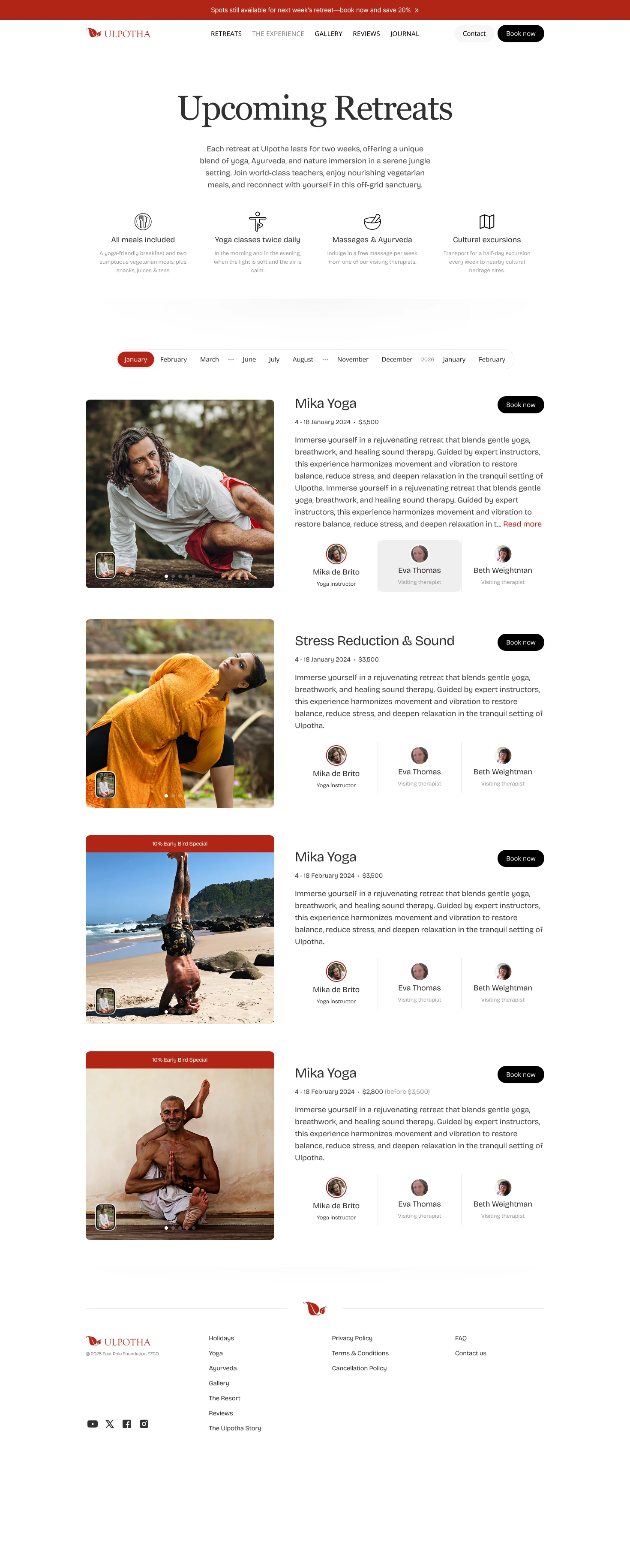
A calmer path
to booking.
Booking a stay involves more than choosing dates. There are guests, accommodation, treatments, transport, and payment to think about.
I organised those decisions into distinct sections, with optional details tucked into expandable rows. On desktop, a separate price summary keeps the selected retreat and cost easy to refer to while filling in the form.
Design choice · Break up the form; keep the cost in sight.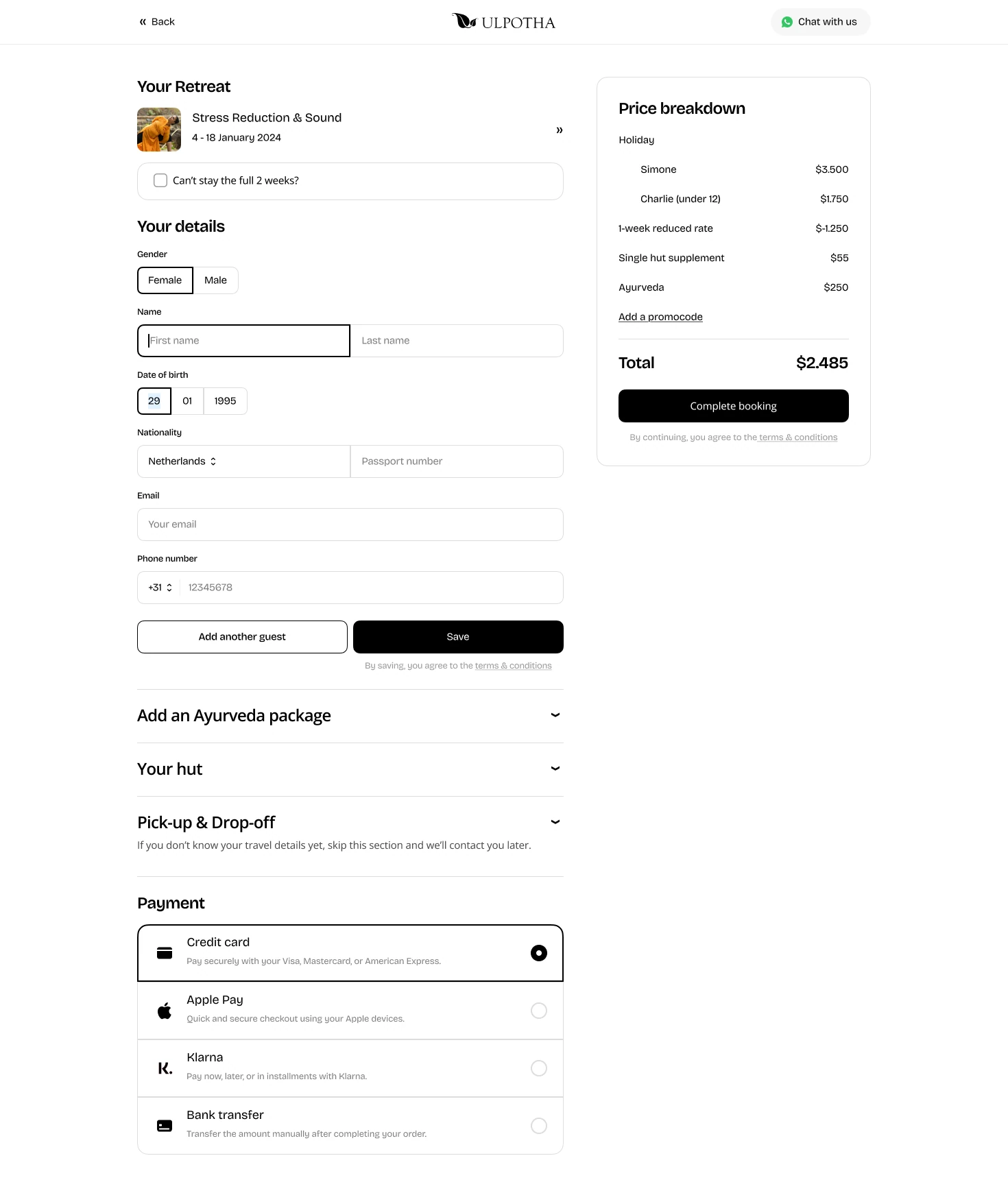

The same feeling.
A smaller screen.
On mobile, the layout becomes a single, readable story. Photography still leads, text has space to breathe, and the navigation stays compact so the experience has room on the screen.
The aim throughout was a website that feels welcoming to explore and clear when it is time to make a decision.
View the mobile design